
This year, 2014/15 the Open Athens statistics for health care libraries in the North West have been calculated differently. There are three measures:
- total number of accesses per Library & Information/Knowledge Service;
- a percentage of the total number of Open Athens accounts against the total number of employees or potential accounts;
- a ratio of the total number of accesses per Open Athens account.
These Open Athens access statistics can be found on the LIHNN / HCLU website here, compiled by Anne Roberts and Steve Glover. The idea for a ratio is based on business ratios, for example comparing key business statistics such as profit to turnover or sales giving the Profitability Ratio (Net or Gross). Probably best not to read too much into specific examples, however, it makes the point that you can get more from comparing statistics as a ratio than just using the bald statistics on their own.
I’d better start with warnings and caveats:
- There are number of approaches to interpreting statistics. While general points can be made there are always specific exceptions, perhaps only known to local Library Managers that might counter a broader interpretation. Regard them as tools to think with, rather than thinking of them in absolute terms.
- For these figures to have any meaning you have to accept that Open Athens usage represents something good. The argument runs something like this. Most, in some cases all, our resources are delivered electronically over networks. Open Athens access is indicative of people accessing resources. The more Open Athens accesses; the more active and informed the user base.
- Some figures for NW could not be calculated because the WTE numbers were not available, mainly for Primary Care and Commissioning organisations.
Keeping these observations in mind here are some general comments on the interpretation of the numbers.
- Total number of accesses per Library & Information/Knowledge Service
These are the big numbers ranked largest first. It’s easy to speculate but hard to know in detail what might be driving these. At a guess a large NHS Trust with an active library service is going to be near the top and smaller NHS Trusts with active library services are going to appear at the middle. At the lower end of table it’s hard to be sure what’s going on. - Percentage of the total number of accounts against the total number of accounts
This percentage gives a measure of the penetration of Open Athens accounts against the number of potential Open Athens accounts holders or the WTE staff numbers for the NHS Trust. The gap between the highest and lowest is 28.8% ranging from 7.5% to 36.3%, with an average of around 20%. - Ratio of accesses per Open Athens account
This gives a measure of how active accounts are or how many accesses per account. The ratios vary from a low of 0.3 and a high of 5.27 with an average of 1.8.
The questions posed by the numbers depend on where you are in the range of figures and why you think you are there. If you want to perform better against the average or best, how do you drive up Open Athens registrations or increase usage of Open Athens authenticated resources? If you are already performing well against the average, what is it that you are doing well? Is there anything you can share? If you disagree with the figures what are your specific arguments against them? What are the local circumstances that make them less relevant or meaningful?
A model of Open Athens usage
Another way to consider the numbers is to look at them together. Chart 1 plots the percentage of Open Athens Accounts against the ratio of accesses per Open Athens account. It provides a clear trend (see trend line) with low penetration of Open Athens accounts correlating to low usage.
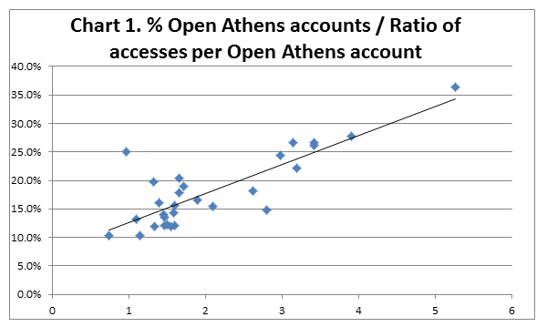
Chart 2 divides the Chart 1 into four quadrants representing the four dimensions of Open Athens usage. It’s perhaps worth saying that the four by four box, a favourite of management thinkers and theorists can lead to four by four thinking: changing reality to fit the model not fitting the model to reality. Accepting that, I think there is something to learn from this. So here is what the four quadrants represent with appropriate epithets. See in conjunction with Chart 2.
- High penetration – Low usage ( Target Driven )
- High penetration – High usage ( Active Management )
- Low penetration – Low usage ( Laissez-Faire )
- Low penetration – High usage ( Research Driven )

B & C The ideal is to be in B. Although the majority are in C. How to move up from C to B is the strategic challenge. Strategic, as it takes a whole library effort (marketing, training, communication etc.) to move both registrations and usage.
D is empty. The scenario of a few highly active users, for example researchers, doesn’t seem to be supported by this data.
A seems improbable. However, I don’t think I am telling any tales in revealing that the lone data point in A is NWAS LKS. NWAS LKS has set a target to raise Open Athens Registrations as a key metric. Perhaps too successfully as the current number is 31% raising NWAS LKS further into the quadrant. The focus on usage has not kept pace with the measures in place to drive registrations.
What do we learn?
What you might learn from the 4 X 4 box depends on you. If you manage a library you might place your library in the grid and use it as a tool to think about where you might want to be in the future and how you might get there. You can benchmark your performance against this data or if you have regional or other data benchmark yourself against similar libraries. The key questions never change. Where am I now? Where do I want to be? How do I get there?
Matt Holland
NWAS LKS support by HCLU North
@NWASLibrary
